- Organization: Urban Institute, a nonprofit public policy research institute based in Washington, D.C.; project funded by the Gates Foundation.
- Date: Fall 2023
- Role: Data visualization and development (data storyteller, visualization designer/engineer, web developer).
- Audience: Federal, state, and local policymakers; nonprofit service providers.
- Main Tools:
Rfor exploratory data analysis,Figma/FigJamfor design and brainstorming,D3.jsfor visualization engineering, andSvelteKitfor web development. - Project Highlights: Custom force-driven radial visualization crafted for the research framework; scrolling, animated explanatory narrative; and exploratory data tool. Longlisted for the 2024 Information is Beautiful Awards.
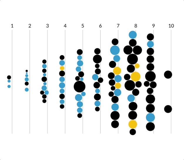
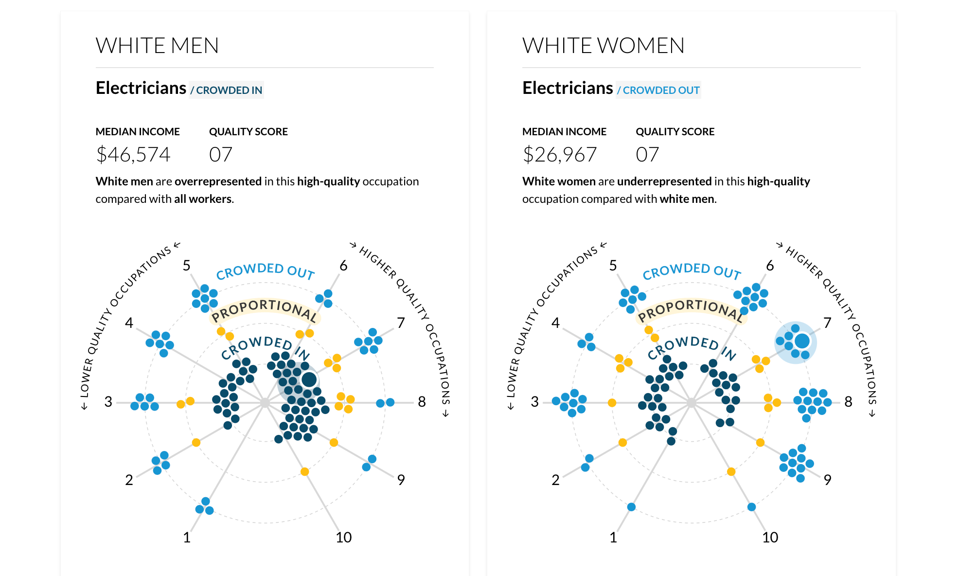

Table of Contents
- Project context and prep work
- Visualization design and development
- Audience and stakeholder reception
- Major reflections and learnings
Project context and prep work
The Urban Institute employs full-time writers, data visualization specialists, and interface/interaction design experts on the Communications team (COMM) to tell the story and increase the accessibility of public policy research. End deliverables can range from static blog posts to highly dynamic, custom dashboards. All projects come to COMM through an intake form detailing the project goals, scope of end products, desired timeline, team budget, etc. The research team had completed their analysis, prepared a finalized/clean dataset, and shared the initial draft of a 40+ page written report detailing their methodology and findings.
By developing a comprehensive framework and job quality “score” for 108 occupations, the research seeks to highlight the mechanisms that keep marginalized groups in lower-quality jobs and to inform policies that could address these deep-rooted disparities. Data sources include the American Community Survey, Current Population Survey, Bureau of Labor Statistics Occupational Employment and Wage Statistics, and many more.
Build team formation and project kickoff
The COMM project manager formed a build team consisting of a writer, a data visualization/web developer (my role), and a designer. While we all work collaboratively and don’t have strict roles, the responsibilities are usually divided as follows:
- Writer: text and narrative flow creation
- Data visualization/web developer: data cleaning and analysis, visualization design and engineering, web development
- Designer: page layout and interaction design
- Project manager: stakeholder communication and schedule maintenance
The kickoff conversation with the research team allowed the build team to ask questions of the researchers to better understand how target audience, funder goals, and research findings could be translated into a custom, data-driven product. Here are some important quotes we heard about desired functionality:
“We want an interactive web page so people can, for example, click on a race/gender group and an occupation and see the occupation quality and how crowded they are in the occupation.”
“…being able to see a particular occupation and see how it rates based on indicators.”
Through this conversation, our team realized the final product needed to detail the methodology and findings (explanatory narrative) before enabling users to explore the data (exploratory tool). Additionally, early access to finalized data would prove to be a huge benefit for the build team, allowing us to begin brainstorming and conducting exploratory data analysis right away.
Brainstorming and exploratory data analysis
Early on in the brainstorming process, our build team decided the piece would explain the complex research methodology by highlighting a “low-quality” occupation and a “high-quality” occupation to give context before allowing users to explore the dataset themselves. While the writer and designer began to think through the narrative flow and page layout, I began to conduct exploratory data analysis (EDA) on the research team’s finalized dataset. Since the analysis was already completed by the researchers, my EDA focused on understanding the data structure and identifying potential visualizations that could be used to tell the story. I used R and ggplot2 to create an exploratory analysis notebook for documenting my learnings and notes, which I continuously shared with the build team for feedback.
Visualization design and development
Data tool creation workflows at the Urban Institute follow a relatively straightforward waterfall model, where the build team works closely with the research team to understand the data and findings before creating a low-fidelity wireframe, a high-fidelity mockup, the developed product, and final feedback. Prior to development, the process is iterative, with regular check-ins and feedback loops to ensure that the final product meets the needs of the target audience and aligns with research goals. Since I was the only developer on the project, I was managing my tasks in small sprints and working with the project manager to ensure milestones were being met on time.
As I shared my domain learnings and EDA findings with the build team, we discussed how a custom visualization could be used to tell the intertwined story of occupational crowding and job quality. Drawing on inspiration from other Urban Institute projects and external organizations, I decided to explore non-standard visualization forms.
Initial d3.js sketches
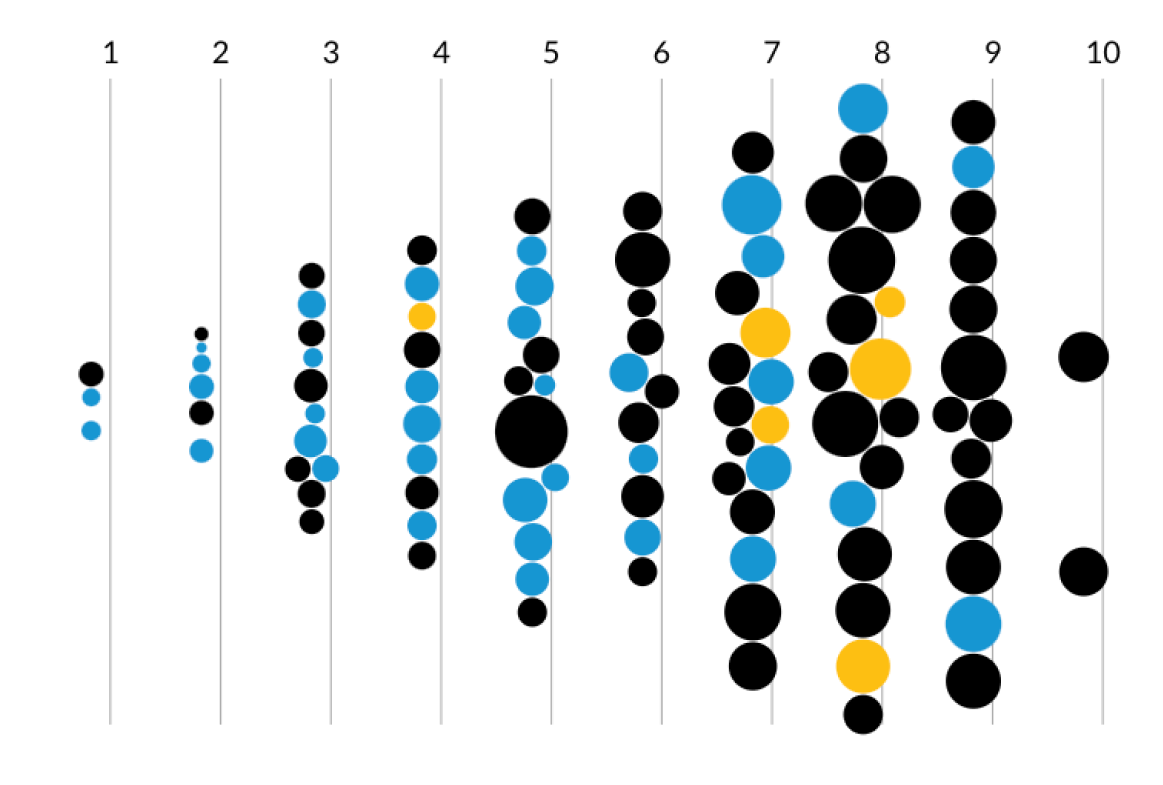
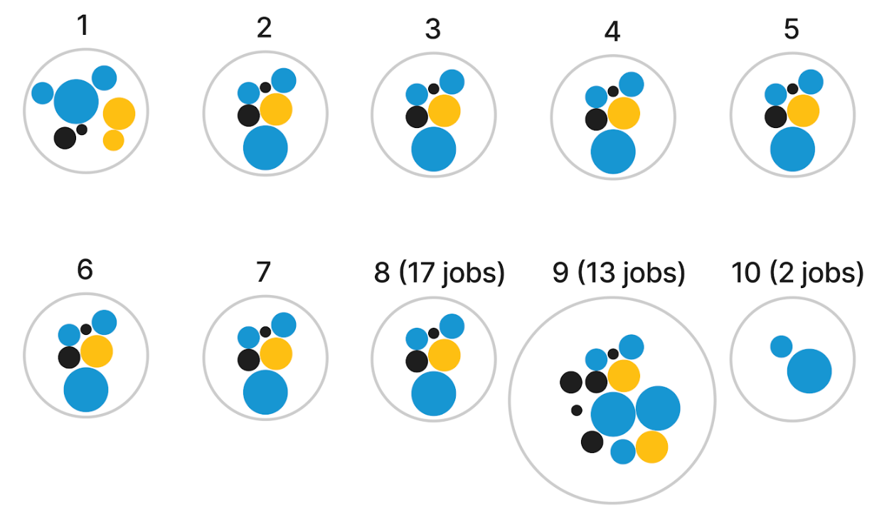
Due to the multivariate nature of the dataset, I turned to D3.js to sketch a force-directed graph view where each node was an occupation. My goal was to highlight two main variables for each occupation: the categorical occupational crowding variable (color heuristic) and the continuous job quality variable (position). The initial ideas below encoded the median job salary into the radius of the nodes to show that, for example, minority groups were “crowded out” (black nodes) of higher paying jobs (large radius) which had higher quality scores (positioned on the right). Later on in the project, I would set the radius to a constant value to reduce visual overwhelm.
Moving to a radial layout
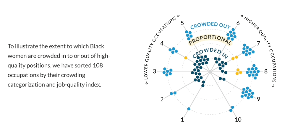
After some discussion with the build team, I realized the layout of the initial force-directed graph was not as engaging as I had hoped. Through my research of force-directed graphs, I became curious about a radial layout. I was imagining a “constellation” of nodes where the “crowding” variable could be physically represented by the distance from the center of the radial layout. The “crowded in” nodes would live directly in the center, “proportional” nodes would live in the next concentric circle, and the “crowded out” nodes would live in the outermost concentric circle.
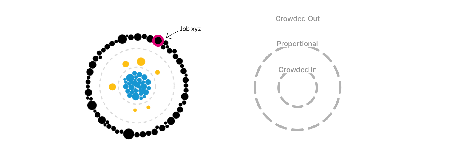
Doubling down on this radial “constellation” idea, I explored having the crowding variable represented as its continuous value to highlight the extent to which a group was crowded in or out. A value from 0.1 to 0.9 was “crowded out”, a value from 0.9 to 1.1 was “proportionally represented”, and a value of 1.1+ was “crowded in”. This is where I began to explore the idea of a “scrollytelling” experience, in which the visualization could animate to “expand” as the user scrolled down the page.

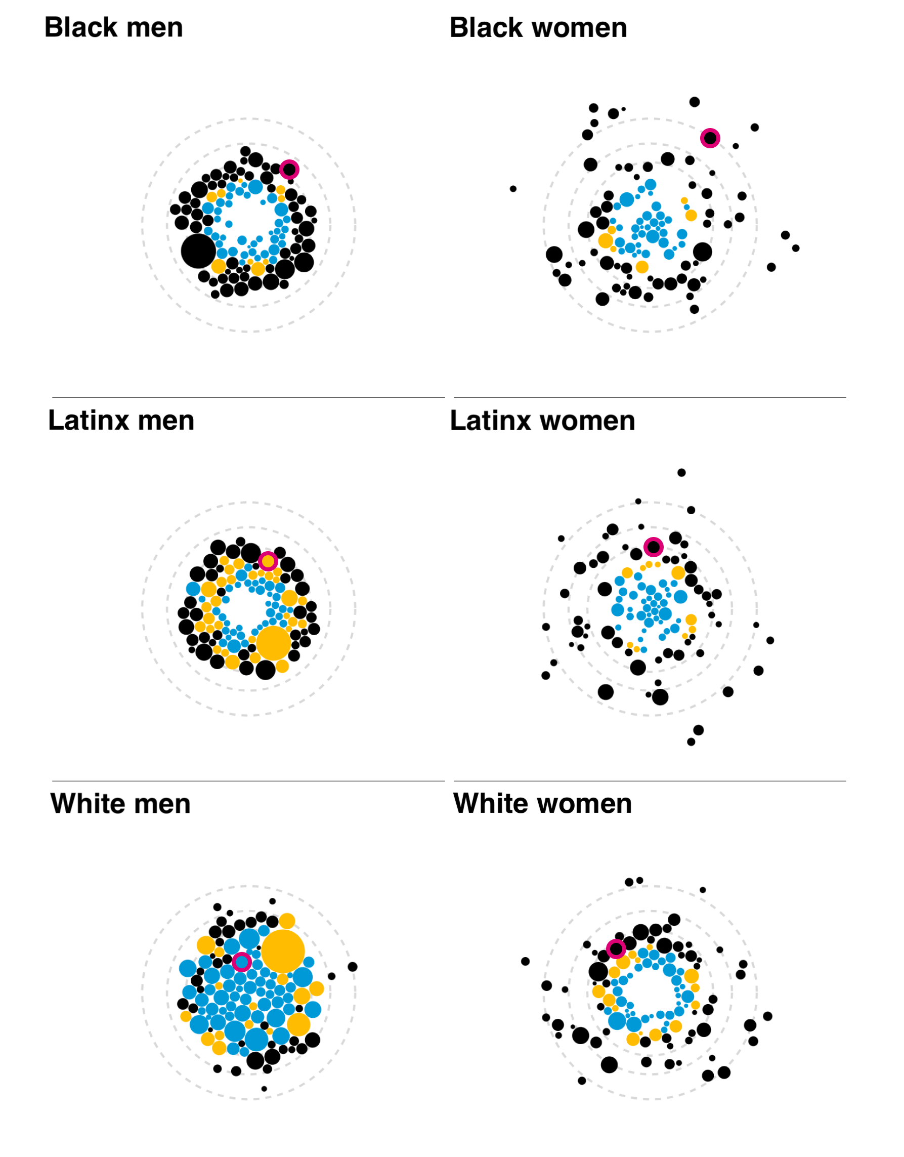
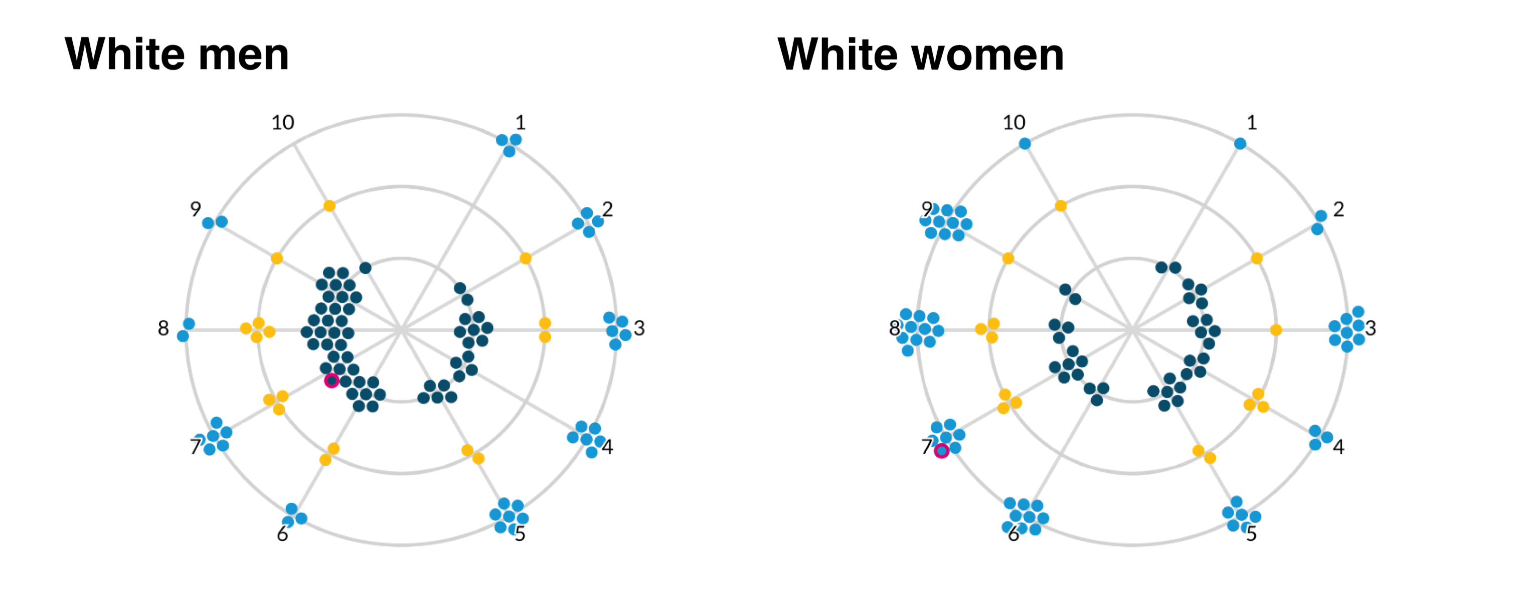
My plan was to introduce and explain the visual form for one race/ethnicity group through scrollytelling, and then move to an exploratory section featuring all six groups. The user would select a single job (outlined in magenta) and see how each group was crowded into/out of that job. The disparity between men and women was quite clear, with the White men group having many tightly clustered blue nodes or “crowded in” jobs. The last addition would have been a toggle for low- and high-quality jobs, so users could see which groups were crowded into which jobs. I was happy with how visually engaging these visualizations were, and interested in hearing reactions from the build and research teams.
Too abstract!
As you can probably guess, the immediate feedback was that while it was visually appealing, gathering clear insights was difficult. I needed to go back to the drawing board a bit but had a few clear action items based on the feedback and priorities of the research team:
- Integrate the job quality score as a continuous variable
- Keep the crowding measure in its categorical form
- De-prioritize the median job salary in the visual form
- Add clear, on-screen labeling and legends
- Remove the color black from the color palette as to avoid any connotation that there was a connection to the Black men/women groups
Finding inspiration from the data visualization community
At this point in the process, I was back to sketching in R but wasn’t able to integrate the action items with the same level of visual interest I desired. Thanksgiving break was approaching and I had just received my copy of Alberto Cairo’s latest book “The Art of Insight: How Great Visualization Designers Think”. During the break, while relaxing with my family, I dove into the amazing interviews, process details, and personal stories of data visualization practitioners I admire. In chapter 4, Cairo interviews data visualization artist and industry leader Nadieh Bremer. The chapter features her “Why do cats and dogs?” project, a collaboration with Alberto Cairo and Simon Rogers (among others), detailing how dog and cat owners Google search for information about their pets. Nadieh presents a playful analysis of top questions people Google search that begin with phrases like “why do cats/dogs”, “why does my cat/dog”, and related variations.
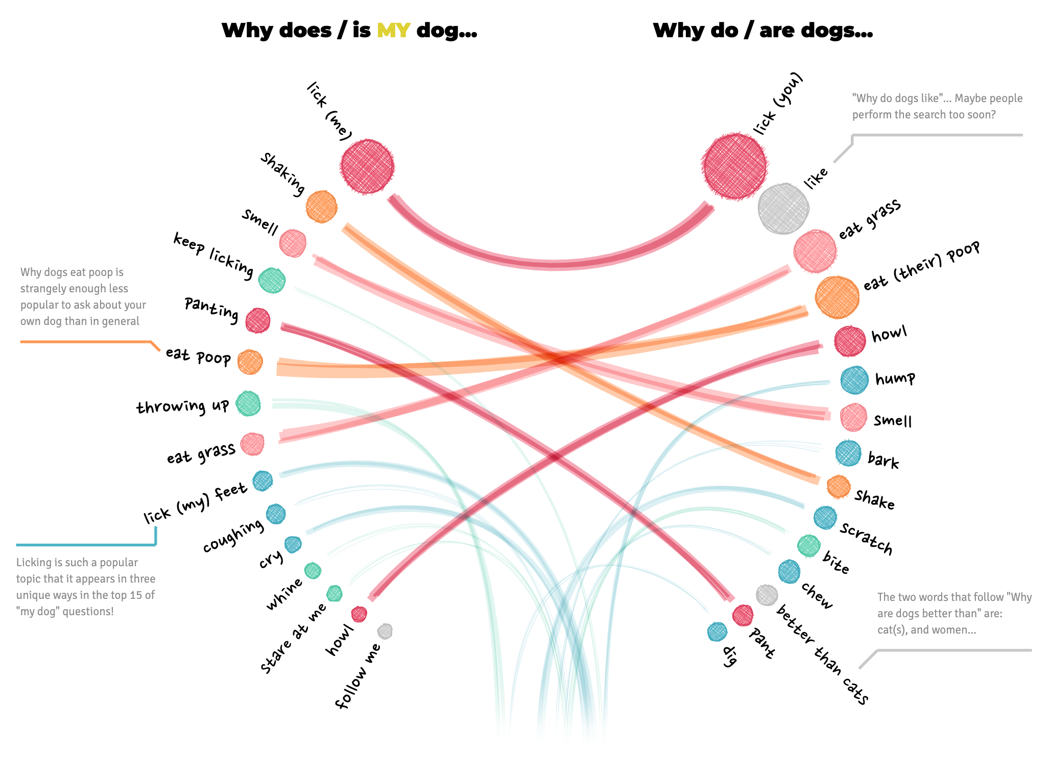
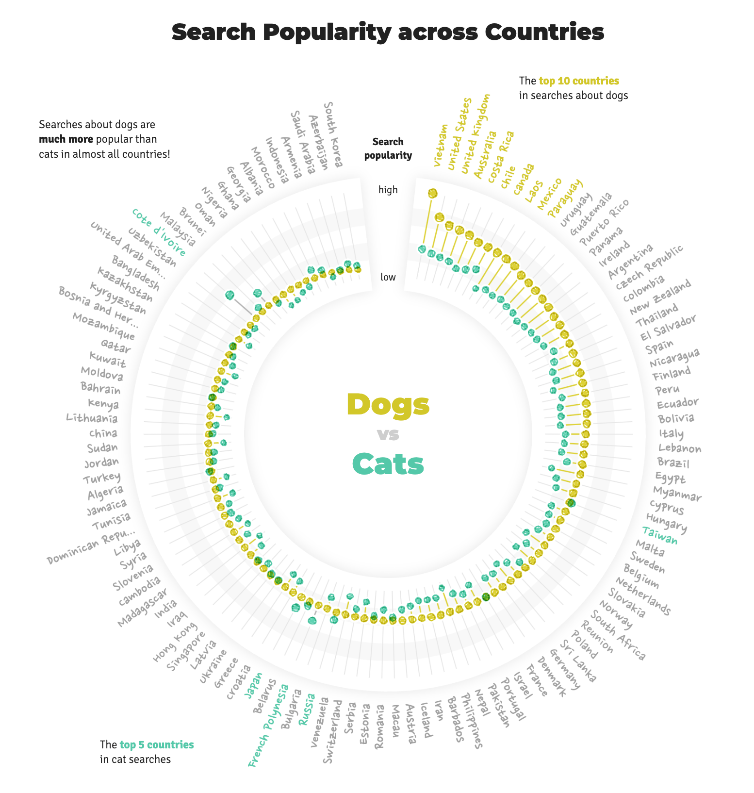
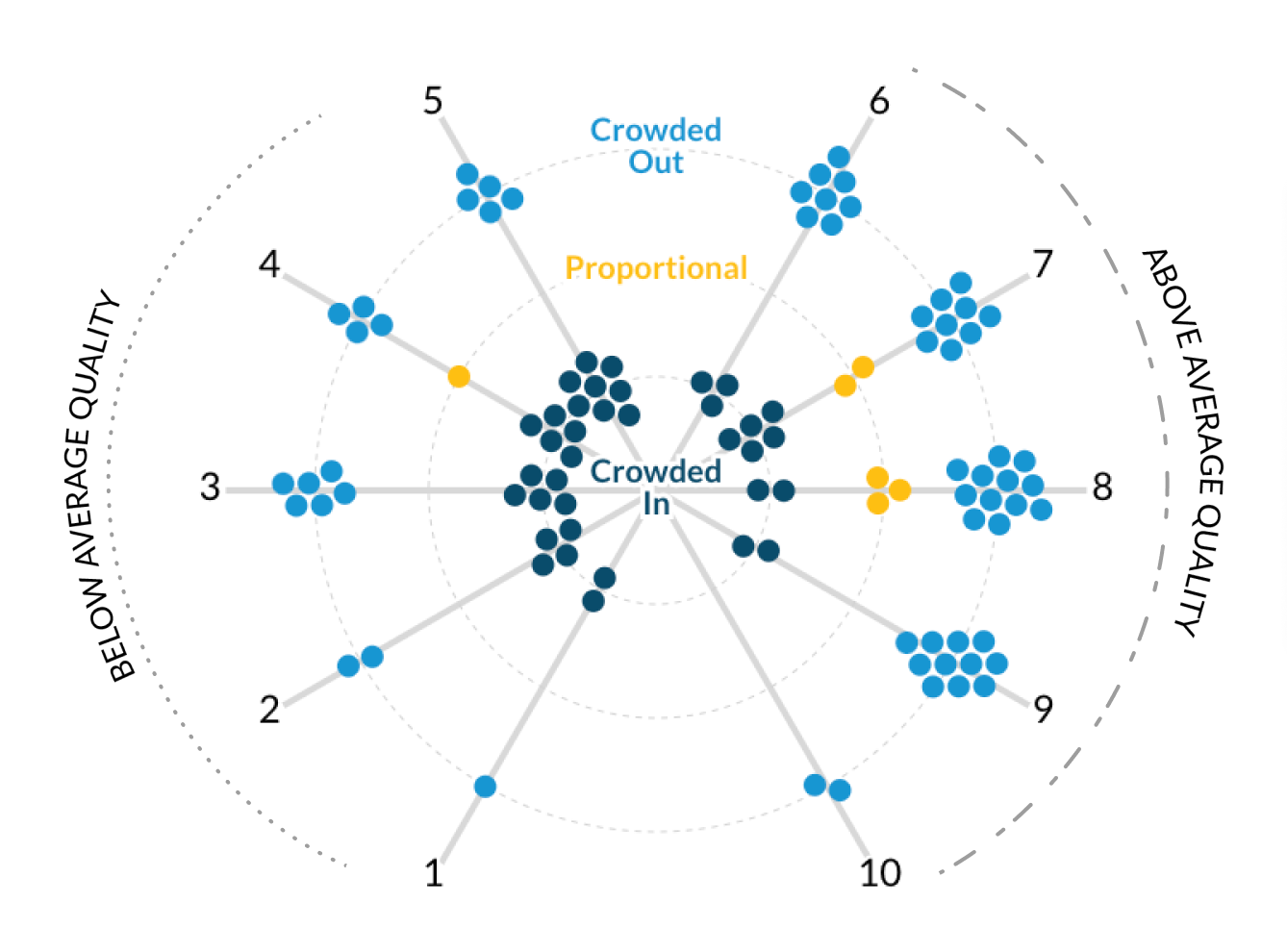
I remember the feeling of excitement and inspiration I had when I saw the layout of the radial visualizations. “That’s it!” I thought, I could use a polar coordinate system to set the node’s angle based on job quality score, and its distance from the center based on the crowding variable. I quickly tested the layout in R and was thrilled with the initial results. I would condense the angles of the left and right sides to coincide with “above average” and “below average” quality scores. By keeping the node radius constant, I could reduce the amount of visual overwhelm while still making it clear which side featured more “crowded in” vs. “crowded out” occupations.
Finalizing the visual form and page flow
My build team and research colleagues were excited about this solution. We discussed how users would interpret the visualization form and what we could do to help them get familiar with it. After another brainstorming meeting, we made a few adjustments together to enhance legibility:
- The crowding variable needed inline labels to remind users of the meaning behind the color/position heuristics.
- The “spokes” or job quality axis lines should revolve in ascending order from left to right.
- Adding “below/above average quality” guides on the outside of the job quality will remind users of the meaning.
While the R-based solution was great for prototyping, this visualization would need to be built with D3.js and SvelteKit for full hover/click interactivity and animations for the scrollytelling section. Polar forces were not part of D3’s standard force simulations but thankfully Philippe Rivière from the Observable team created a custom implementation! This was a huge unlock to bringing this visualization to life and I’m very grateful for Philippe’s work.
Now that the visualization form was finalized, I began planning the scrollytelling animation sequence and matching it to the draft narrative text.
My design colleague and I worked together to integrate this new visualization and scrollytelling sequence into the final version of the high-fidelity project mockup in Figma. The mockup matches the final product closely, with the exception of some minor visual adjustments made during and after the development process. I had everything I needed to enter the development phase of the project.
Web development and final feedback
The data visualization team at Urban uses a modern web development framework called SvelteKit (originally created for data-driven applications at the New York Times). Using D3.js and a Svelte-based graphics framework called Layer Cake I translated the Figma mockups into a Svelte app that matched the design specifications for the three device widths we design for (mobile, tablet, desktop). This involved creating reusable components for the various elements of the visualization, implementing the scrollytelling interactions, and ensuring that the final product was responsive and accessible. You can check out the project’s GitHub repository, but here are some technical highlights:
- Integrates our team’s Storybook-based Svelte component library
- Uses
d3-forcefor the polar force simulation - Uses
svelte-scrollerfor the scrollytelling functionality - Uses
svelte-textfitfor managing dynamic text that alters div height - Integrates writable and derived Svelte 4 stores for managing state and interactivity
After getting the developed tool into the hands of the build team, my data visualization colleagues, and research colleagues for final feedback and general QA, we received no major feedback because the developed tool matched the mockups so closely. After making some small visual label and inline text adjustments, the project was ready for launch! Other COMM colleagues worked with the research team on an engagement plan to share the project with Gates Foundation program officers, policymakers, nonprofit service providers, relevant news outlets, and other related stakeholders. The final product launched in late January 2024 after about four months of design and development.
Audience and stakeholder reception
Although it’s hard to quantify impact of a tool produced by an independent research organization, the data visualization team conducted direct user feedback sessions to understand how the tool was being used. A workforce development manager in the Midwest spoke to us about how they were using the tool to help make the case to their clients for diversifying their workforce:
“That level of visual interest is important [when] you have a different view of something. It signals a “different way of looking at this topic” — helping bring new life to a topic based on the visualization.”
“We work in sector groups: hospitality, construction, and healthcare. Break[ing] it down by category and tie[ing] it into inclusion topics helps build an argument for going into a new sector and its strategy.”
Other feedback and praise
- Program Officer, postsecondary learning foundation: “It is rare that I find myself playing with a tool! It has a clear explanation of a problem statement. The data viz team deserves a wage stipend.”
- Research team lead, Urban Institute: “[Another organization] is considering exploring funding us to help people use the tool […] and had a lot of questions on how people use it.”
- Director of Design, Urban Institute: “Wonderful work on the Occupational Crowding feature. This one works so well in terms of story, content, design, and interaction.”
- Included in the 2024 Information is Beautiful Awards longlist
Major reflections and learnings
Joining the Urban Institute was a significant step for me in my career as a data practitioner. I was hungry to tell engaging data stories with modern tooling and my team supported my goal of communicating research findings with unique visual methods. After a few relatively standard builds during my first six months at Urban, I was excited to meet that goal in this project with a scrollytelling experience and tool combined with a unique visualization form. I believe this was a successful project because our team gathered feedback early and often, being prepared to pivot and looking to external inspiration when more support was needed. I’m proud of the feedback all team members got on the project and the impact our users and stakeholders communicated to us!