Ben Kates Headshot

Ben Kates 👋 (he/him)

😁 Nice to meet you! I'm Ben, a data visualization developer working at the Urban Institute. I help communicate research findings by building data visualizations for Urban features, Urban Wire posts, and other Urban products using JavaScript (Svelte, D3.js, React) and R (tidyverse, ggplot2). I am also a co-organizer of the Philadelphia Data Visualization Meetup.📊 Before joining Urban in February 2023, I worked with clients across industries at analytics consulting firm CompassRed (acquired by LabWare in 2022) after starting my career as an e-commerce analyst with Burlington (formerly Burlington Coat Factory) in 2015.⚡ Whether it's working with teams in research, non-profits, ecommerce, state & county government, professional services, healthcare, and more, understanding client needs and building them great data products is close to my heart!😄 I am based in Philadelphia, PA, make music on my YouTube channel, and play saxophone in my band Therapy Dawg!✍️ view my blog posts and presentations

📊 Data Apps

Where is the Low-Wage Workforce screenshot

WorkRise: Where is the Low-Wage Workforce?
(Svelte, D3.js, Mapbox)

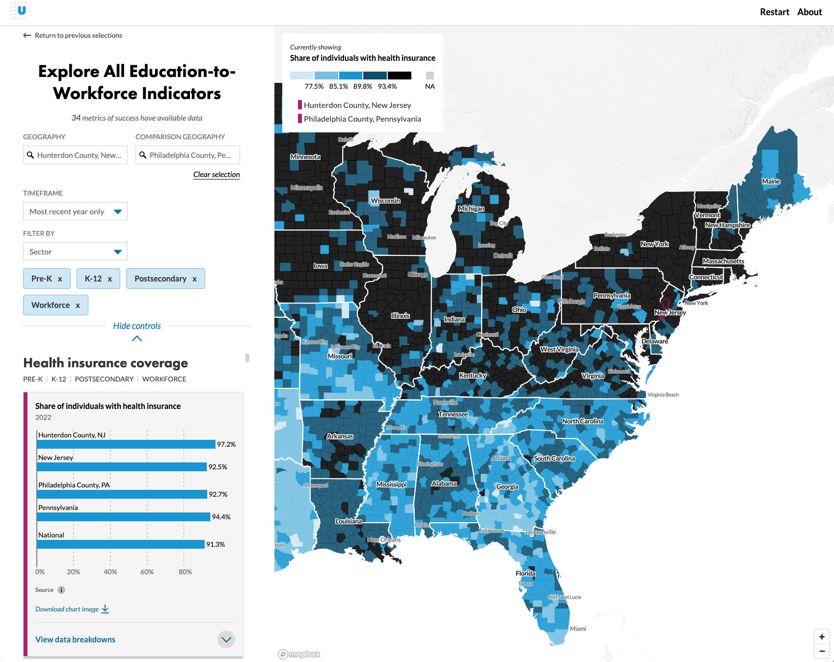
The WorkRise network is an Urban Instute-hosted research initiative focused on upward mobility and the low-wage worker. This feature, along with the accompanying Who is the Low-Wage Workforce? piece, focuses on data exploration around low-wage workers across the country (median wage and low-wage worker share).


North Carolina Immigrant Families Map

Supporting North Carolina’s Immigrant Families
(Svelte, Datawrapper)

Researchers at the Urban Institute conducted interviews with and aggregated data on immigrant families in North Carolina to identify barriers to safety net participation. This project page includes a data tool to explore state and county-level information on immigrant status, region of origin, English proficiency, and other characteristics.The data tool project leverages Datawrapper for the map visualization and the accompanying chart interaction JavaScript, which enables message dispatching.


North Carolina Immigrant Families Map

What We Know About Medicare Enrollment for Dual Enrollees
(SvelteKit, Datawrapper)

Researchers at the Urban Institute calculated changes in dual enrollment by Medicare type. This project included a tab and dropdown-based chart picker, an external tooltip, and a loading spinner.The approach for this data tool builds on the North Carolina Immigrants project, making use of Datawrapper's event interactions (outlined in this blog post).


Job Quality Occupational Crowding screenshot

Getting a Good Job Depends More on Race and Gender than Education
(SvelteKit, D3.js, Layer Cake)

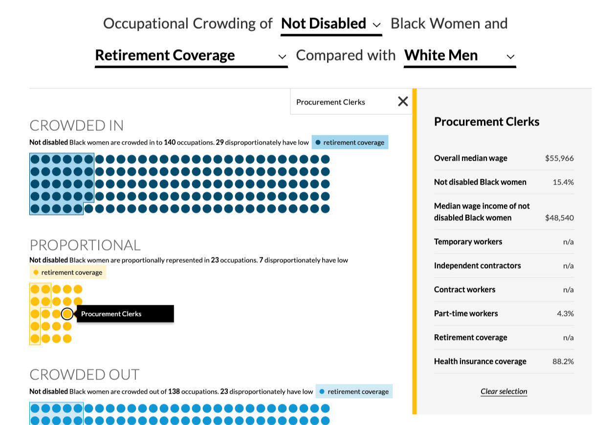
Researchers at the Urban Institute studied how six demographic groups (Black women, Black men, Latinx women, Latinx men, White women, and White men) are crowded into jobs of differing quality. This unique research data allowed me to dive deep into exploration of visual forms that help underline the occupational segregation that exists for non-White male individuals.This project utilizes Layer Cake for visualization management, d3-force for the node simulation, and svelte-scroller for scrollytelling.


What's in My YouTube History: Music screenshot

What's in My YouTube History: Music
(React, MUI)

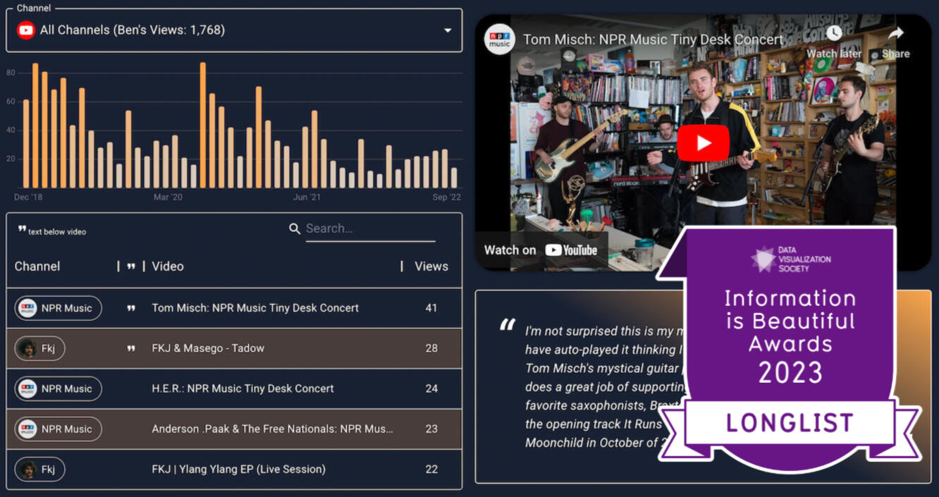
I knew there was something to glean from my YouTube history data, exported from Google Takeout after Reddit inspiration. After some EDA in R using the tidyverse, I quickly I realized there was potential for a data app here.In building this, I dove deep into the visx visualization package from Airbnb, the MUI package for material UI, and the tidyjs data transformation package (among others)


New Castle County COVID-19 Dashboard screenshot

New Castle County COVID-19 Dashboard
(R Shiny + Leaflet + Plotly)

In June of 2020, Delaware's New Castle County (NCCo) Executive Matt Meyer asked CompassRed for a better visualization solution for the wastewater COVID-19 testing program.Alongside a project manager, I led the NCCo team through a 3 week sprint to prototype and build a Shiny app that included an interactive leaflet visualization of the catchment areas being tested. Gathering app requirements and data details in such a short window was exciting but taught me that no matter the time crunch, the stakeholder management process for data products is the same.

🟥 Datawrapper Raycast Extension

Raycast is an incredibly powerful Mac spotlight replacement. In Spring 2024, I built this extension for Raycast with their React-based API. It allows the user to view, search, open, and duplicate Datawrapper data visualizations anywhere on their Mac! I've also thrown in commands for opening the new chart workflow and viewing the tooltip "parser" functions.

📝 Infographics

Who is the Low-Wage Workforce screenshot

WorkRise: Who is the Low-Wage Workforce?
(ggplot2, SvelteKit)

The WorkRise network is an Urban Instute-hosted research initiative focused on upward mobility and the low-wage worker. This feature, along with the accompanying Where is the Low-Wage Workforce? tool, focuses on explaining demographics of the low-wage worker in the United States.Plots were created in ggplot2, using svglite to export as svg, and rendered in SvelteKit to add alt text and CSS like fonts and full width definition.


Self-Care analytics screenshot

Self-Care Analytics Infographic
(Looker Studio)

As part of the CompassRed blog, the team was asked to create data-related content that would not only attract visitors to the site and services, but build content that we were genuinely curious to explore and share! As someone who believes strongly in the benefits of mental health care, I explored what Google search trends were looking like shortly after the start of COVID-19 lockdown (April 2020). Nice to have some news coverage of the piece too!


Music in a virtual world screenshot

Music in a Virtual World Infographic
(Looker Studio)

After my previous infographic-style article, I wanted to continue exploring data that personally impacted me. As an avid fan of musicians on the live-streaming site Twitch and online music education in general, I knew that other people were also experiencing an increase in interest in online music communities after the COVID-19 lockdown began.Aside from Google Trends, I exported data from SullyGnome, a 3rd party Twitch analytics service.


Makeover Monday screenshot

Makeover Monday: Visualizing the Emoji Mashup Twitter Bot (ggplot2)

My first blog post for CompassRed was a custom ggplot2 infographic showing data viz on a really neat Twitter bot called "Emoji Mashup". The bot combined emojis in funny ways which resulted in hilarious expressions. Naturally, I wanted to see which mashups got the most likes and why! Fast forward to 2022 when I was learning D3.js and I recreated the post in JavaScript.

✍️ My Blog Posts

📰 Articles Featuring My Work

📹 My Presentations

Unwrapped Conference 2024: Creating Extended Datawrapper Tooltips w/ Svelte

Delaware Data Innovation Lab Meetup: AR/VR Presentation & Panel Moderation

Philadelphia Data Visualization Meetup: Google Data Studio Past, Present, Future

Mastodon