Projects
Data Tools
Projects I've designed and engineered that focus on interactive data exploration, visualization, and analysis. I'm excited to have open-sourced many of these applications.
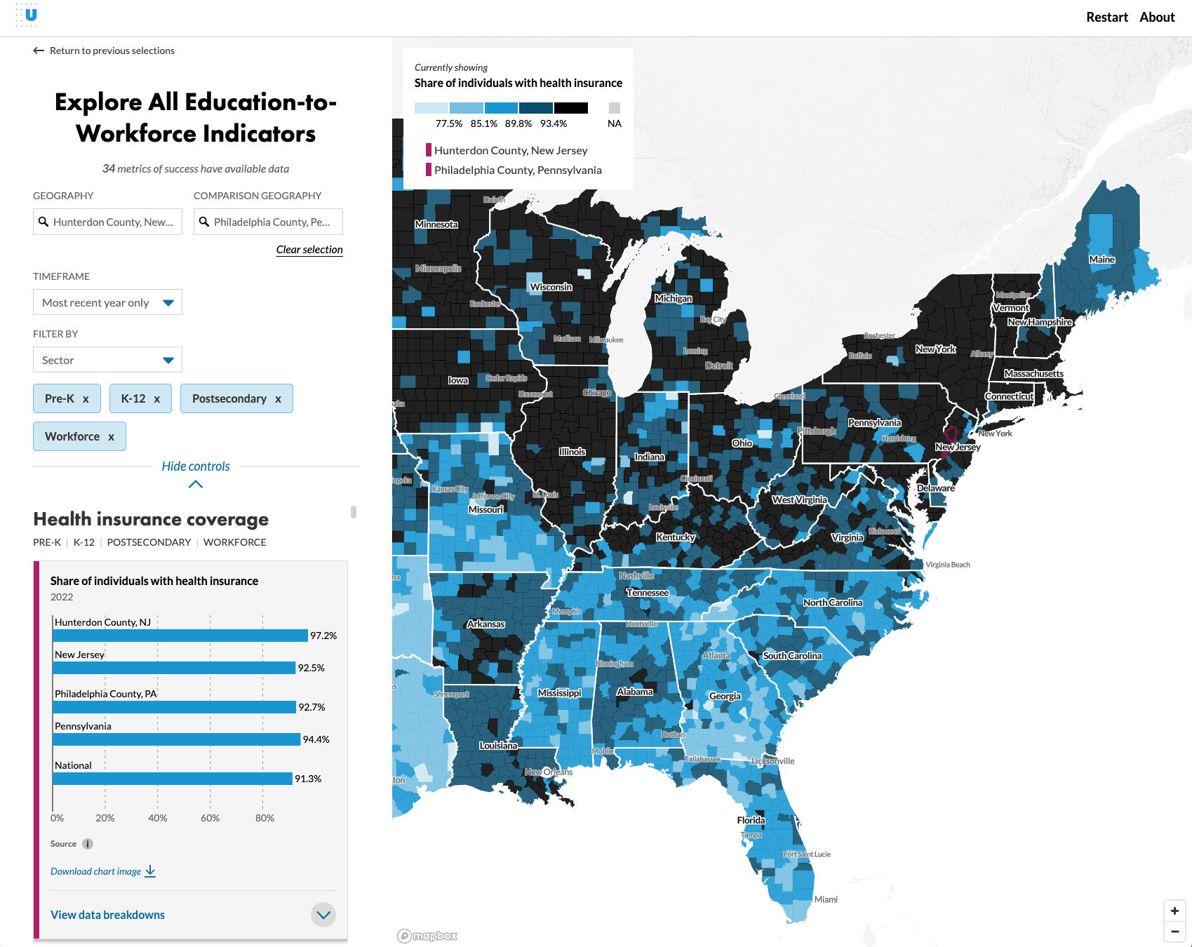 At the Urban Institute, I led the engineering and visualization design of a large-scale data tool that allows users to explore the "Education to Workforce Framework" from Mathematica in states, counties, and Census tracts across the United States. With over 60 multi-year metrics and six categories of disaggregates in each geography, this project enables dynamic download of data visualizations and geospatial analysis with an intuitive interface and a robust component-based architecture.
 -
SvelteKit -
D3.js -
Mapbox -
Figma -
html2canvas -
Turf.js -
Layer Cake
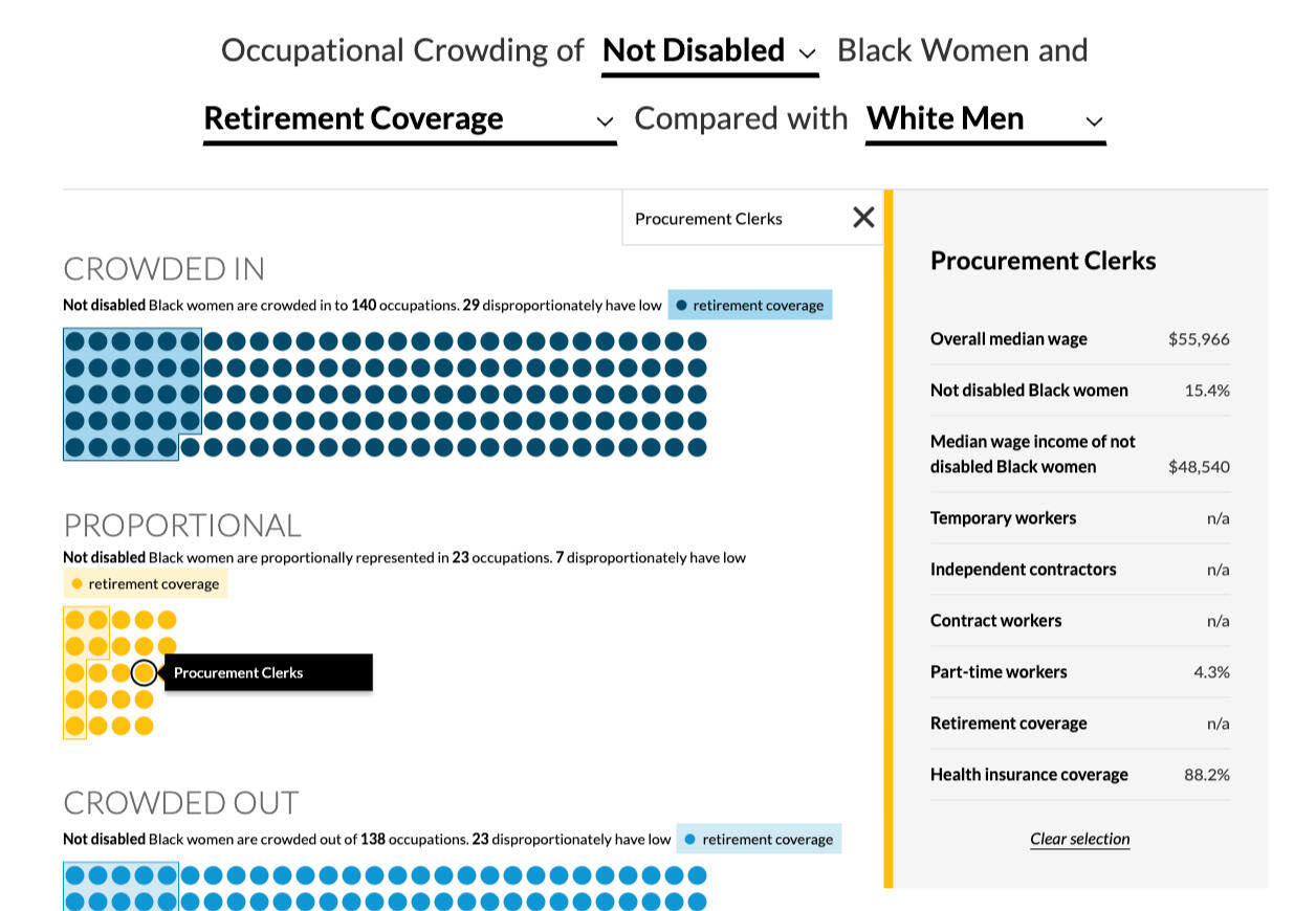
 Researchers at the Urban Institute studied how six demographic groups (Black women, Black men, Latinx women, Latinx men, White women, and White men) are crowded into jobs of differing quality. This unique research data allowed me to dive deep into visual forms that help underline the occupational segregation that exists for non-White male individuals. I worked iteratively to gather stakeholder feedback and refine the visualizations and user interface. This project was featured on the 2024 Information is Beautiful Awards longlist!
 -
SvelteKit -
D3.js -
Layer Cake -
R
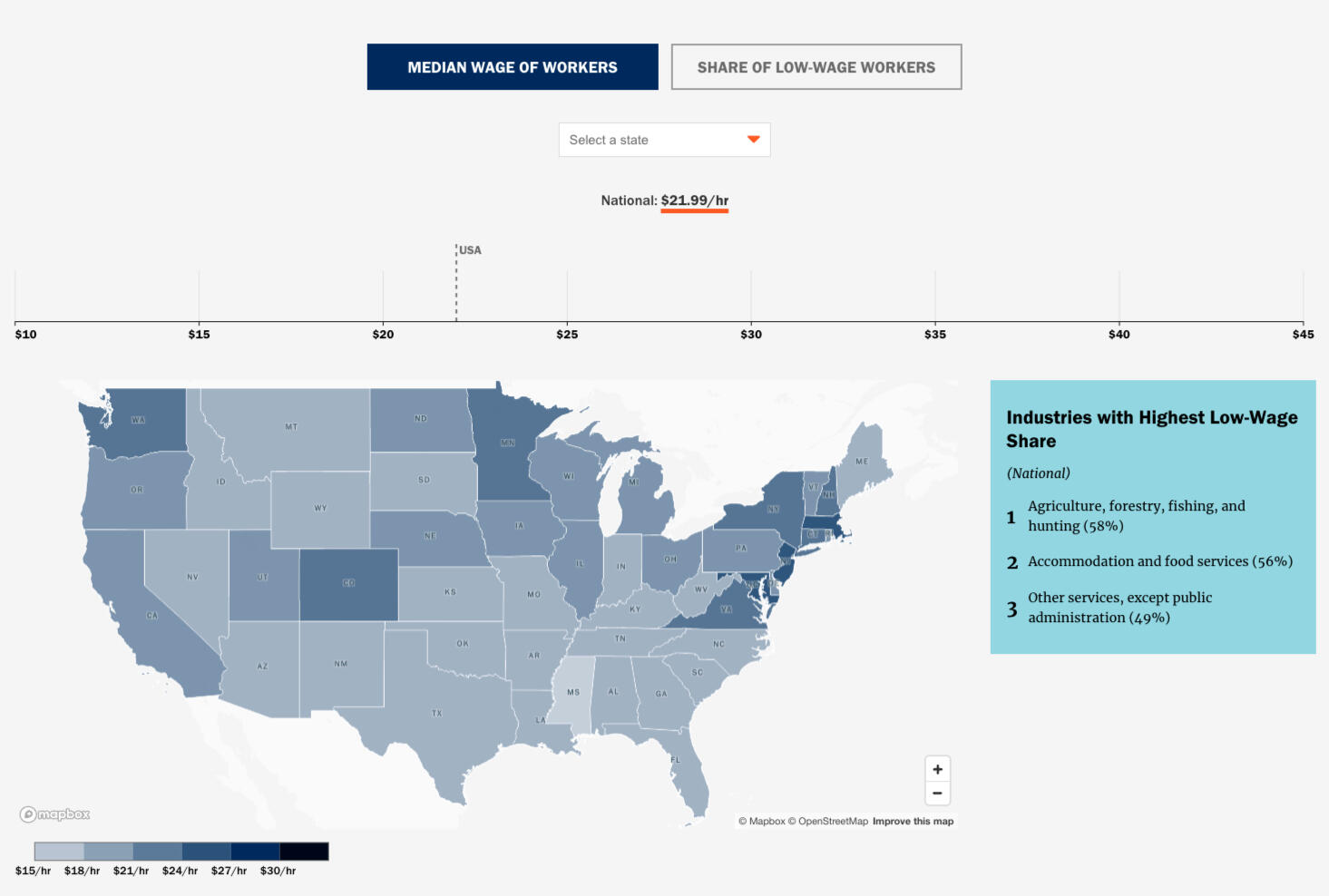 The WorkRise network is an Urban Institute-hosted research initiative focused on upward mobility and the low-wage worker. This feature, along with the accompanying "Who is the Low-Wage Workforce?" piece, focuses on data exploration around low-wage workers across the country (median wage and low-wage worker share).
 -
SvelteKit -
D3.js -
Mapbox -
R
 Building on the occupational crowding research within "Getting a Good Job Depends More on Race and Gender than Education", researchers focused on the experience of Black women in alternative work situations. This explanatory feature and exploratory data tool enables workforce researchers to dive deeper into the occupational crowding of Black women across identity groups.
 -
SvelteKit -
D3.js -
Layer Cake -
Datawrapper -
R
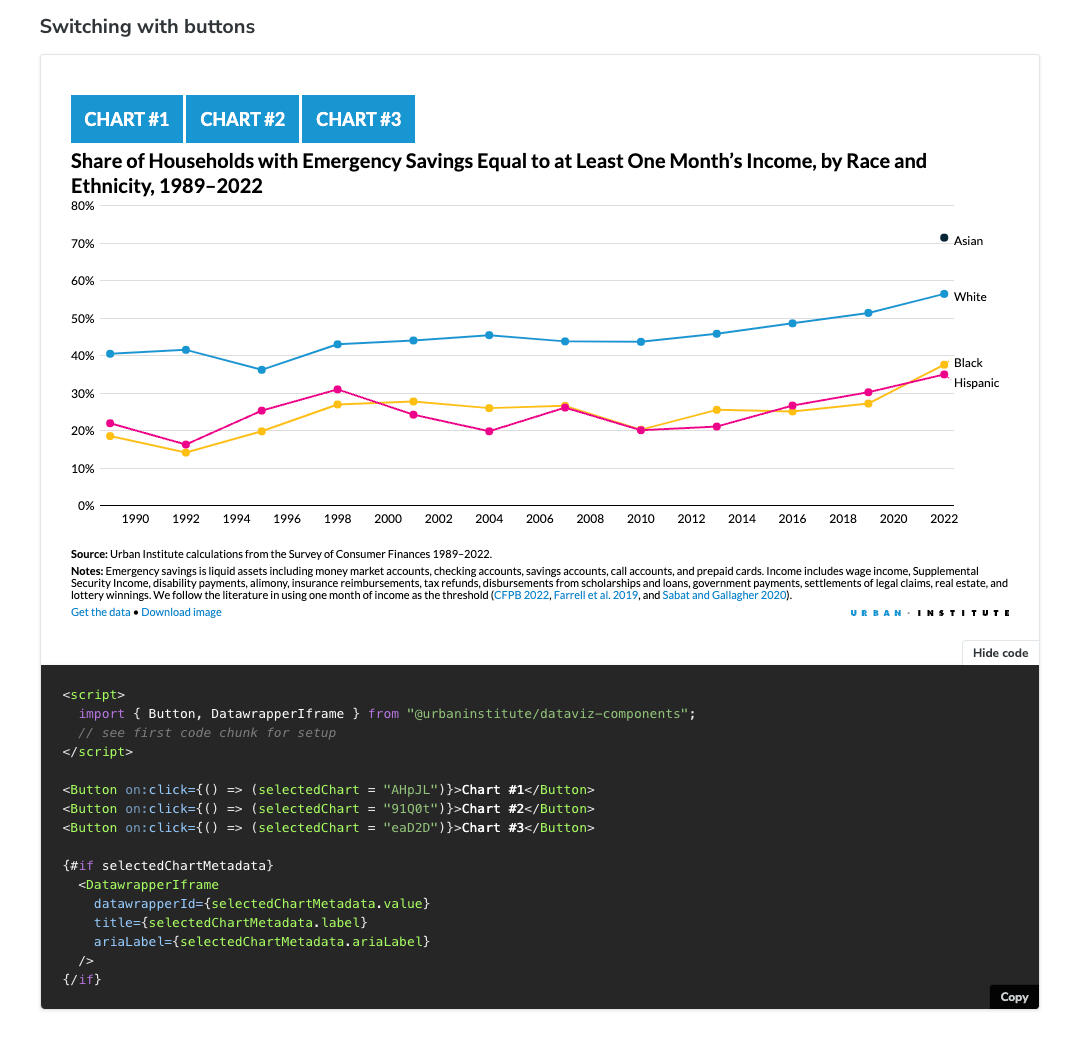
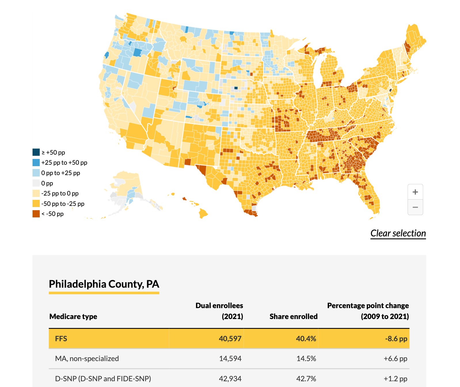 Researchers at the Urban Institute calculated changes in dual enrollment by Medicare type. Combining Datawrapper charts and a Svelte-based UI, this project included a tab and dropdown-based chart picker, an external tooltip, and a custom loading spinner.
 -
SvelteKit -
Datawrapper -
R
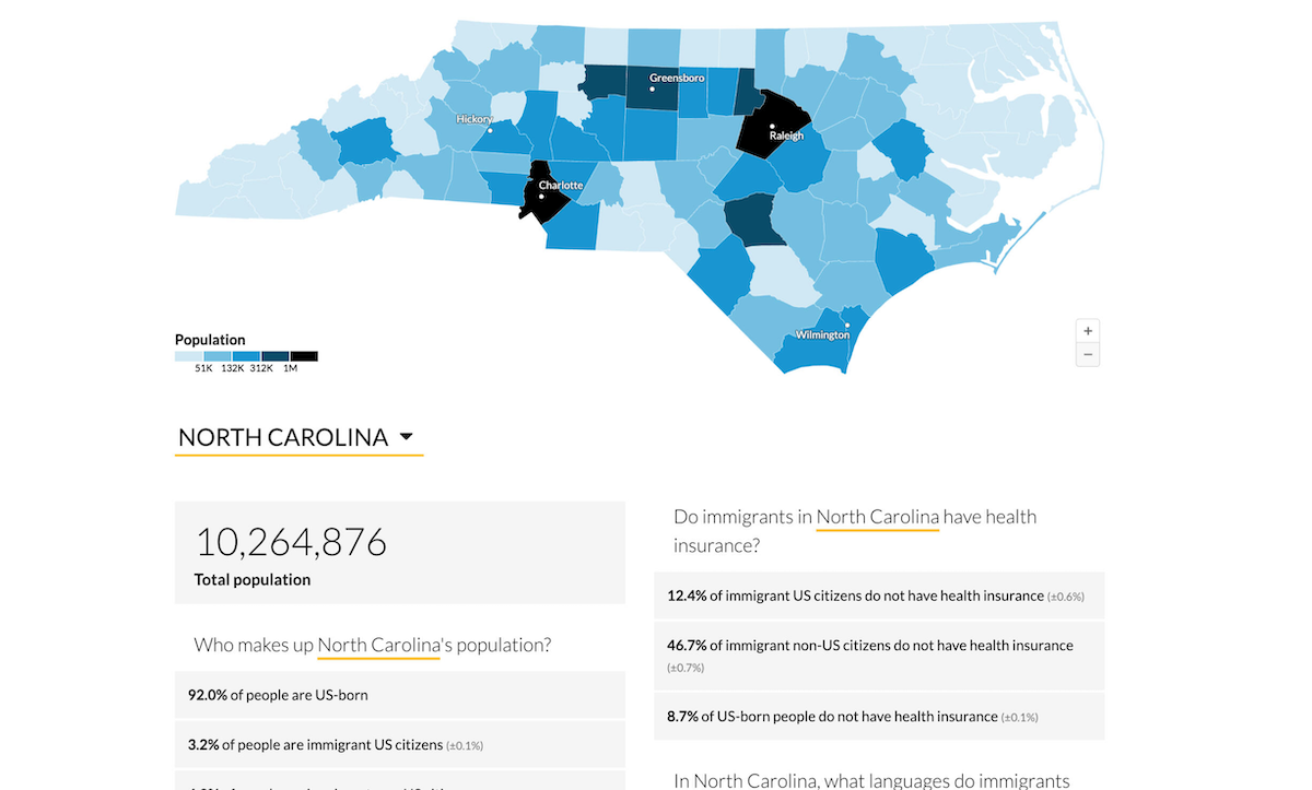 Researchers at the Urban Institute conducted interviews with and aggregated data on immigrant families in North Carolina to identify barriers to safety net participation. This project page includes a data tool to explore state and county-level information on immigrant status, region of origin, English proficiency, and other characteristics.
 -
SvelteKit -
Datawrapper -
R
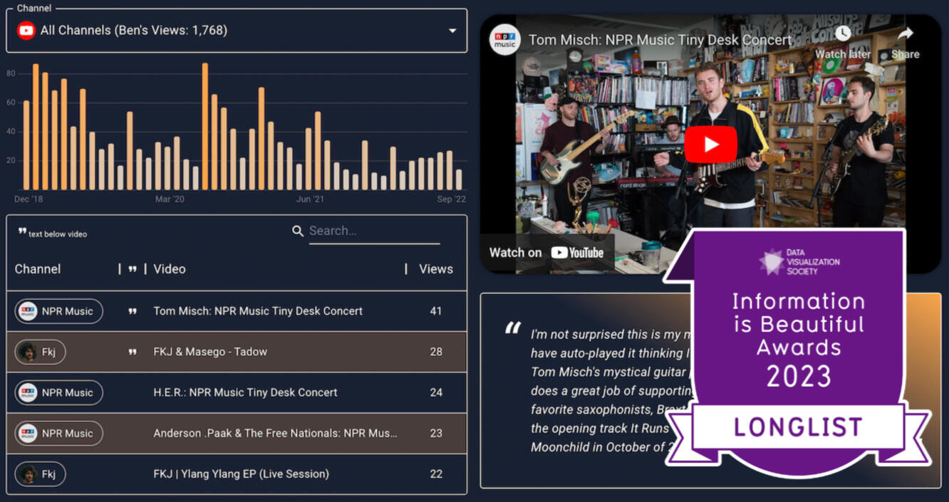 I knew there was something to glean from my YouTube history data, exported from Google Takeout after Reddit inspiration. After some EDA in R using the tidyverse, I quickly realized there was potential for a data app here. This project was featured on the 2023 Information is Beautiful Awards longlist!
 -
React -
Material UI -
visx -
tidyjs -
R
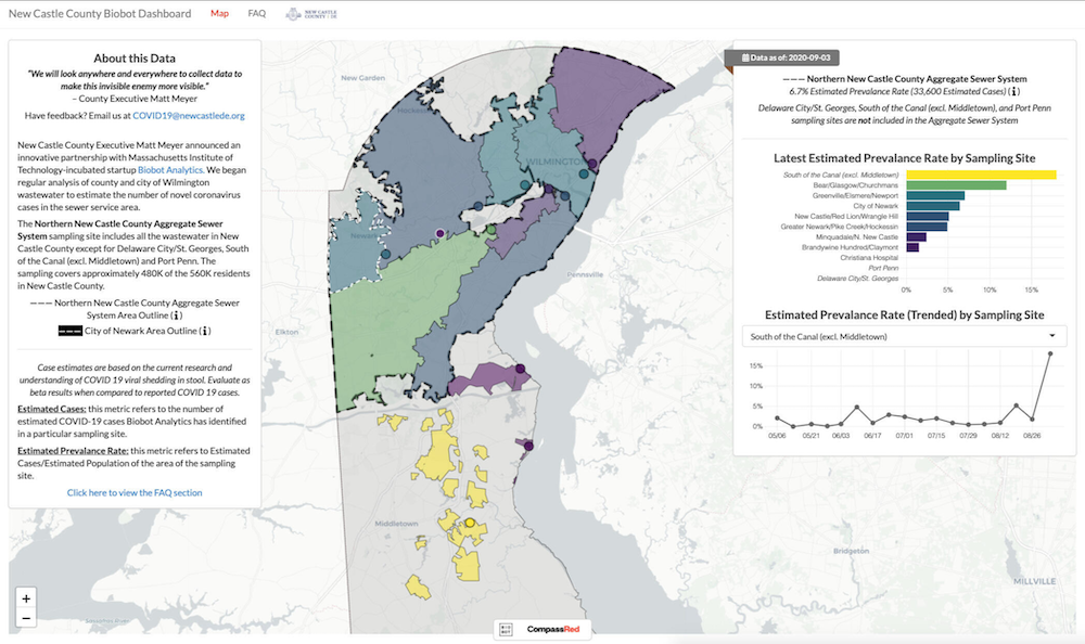 In June of 2020, Delaware's New Castle County (NCCo) Executive Matt Meyer asked analytics consultancy CompassRed for a better visualization solution for the wastewater COVID-19 testing program. Alongside a project manager, I led the NCCo team through a 3 week sprint to prototype and build a Shiny app that included an interactive visualization of the catchment areas being tested.
 -
R Shiny -
Leaflet -
Plotly -
CSS
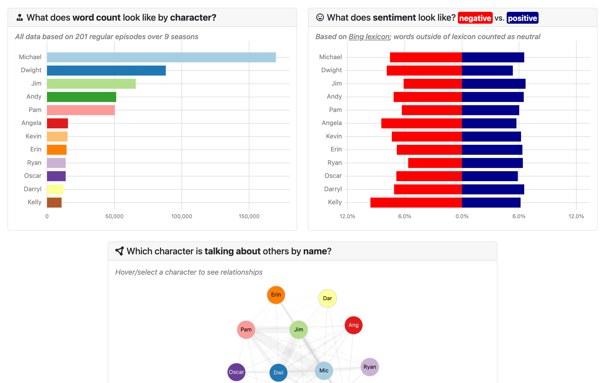 As a big fan of The Office, I wanted to explore the data behind the show. I created a "multi-chart visualization" that allows users to explore the number of episodes each character appears in, the sentiment of their lines, a network graph showing the relationships between them, and a component to show verbatim lines. The project synchronizes visualization components together when a character has been selected.
 -
Svelte -
D3.js -
mark.js -
Bootstrap -
R
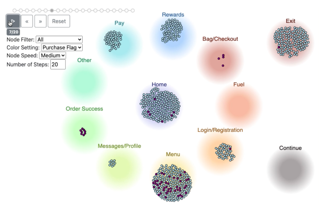 A CompassRed client asked our team to visualize user journeys in their application to find "thrashing" users who were frustrated with the experience and left. I built a D3.js-based visualization that enabled the client to explore the paths that visitors took through the main page types. This web app includes the ability to filter by converting users, style the node color by their first/last page group visited, and to adjust the number of navigation steps. The project was met with enthusiasm by the client who identified the top page groups that were contributing to app abandons. This project has been replicated with fake data.
 -
D3.js -
d3-force -
R -
Google Analytics
Infographics and Reports
Projects I've designed and developed that present research findings and insights with static data visualization.
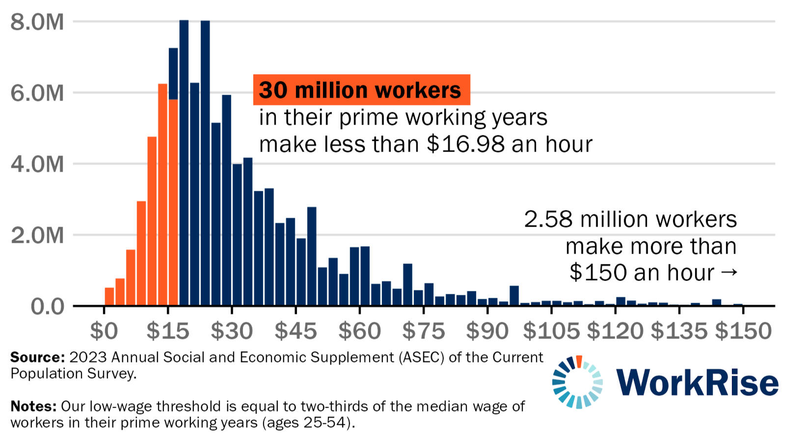
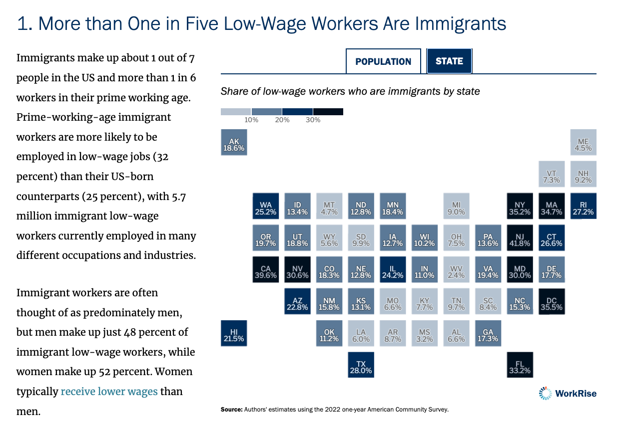 The WorkRise network is an Urban Institute-hosted research initiative focused on upward mobility and the low-wage worker. The research findings focus on the demographics, employment patterns, and educational backgrounds of immigrant workers in low-wage sectors.
 -
Datawrapper -
SvelteKit
 This feature, along with the accompanying "Where is the Low-Wage Workforce?" tool, focuses on explaining demographics of the low-wage worker in the United States. Researchers reveal findings about gender, race, education, and industry concentration, describing who is most affected by low wages in the United States and where policy interventions can improve job quality.
 -
R -
ggplot2 -
SvelteKit
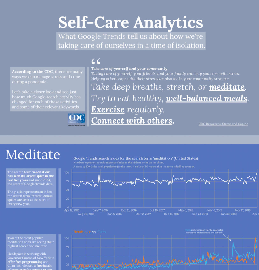 As part of the CompassRed blog, the team was asked to create data-related content that would not only attract visitors to the site and services, but build content that we were genuinely curious to explore and share! As someone who believes strongly in the benefits of mental health care, I explored what Google search trends were looking like shortly after the start of COVID-19 lockdown (April 2020).
 -
Looker Studio -
R
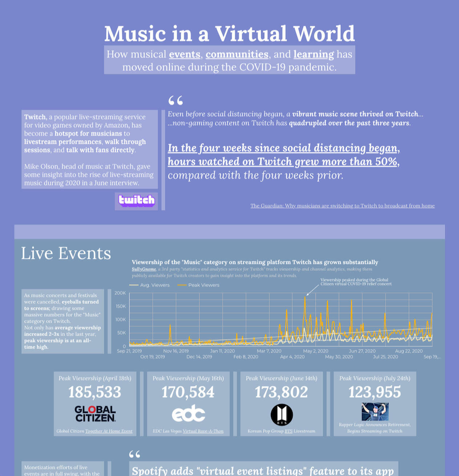 After my previous infographic-style article, I wanted to continue exploring data that personally impacted me. As an avid fan of musicians on the live-streaming site Twitch and online music education in general, I knew that other people were also experiencing an increase in interest in online music communities after the COVID-19 lockdown began.
 -
Looker Studio -
R
Developer Tooling
Projects I've built that assist developers in building and maintaining projects and applications.
 At the Urban Institute, I developed reusable Svelte components with Storybook to reduce development time in projects and align on team standards. I created Storybook examples consisting of multiple components that could be easily copied for repeatable workflows across the organization's project stack (from small blog posts to large custom features).
 -
Storybook -
Svelte -
Datawrapper
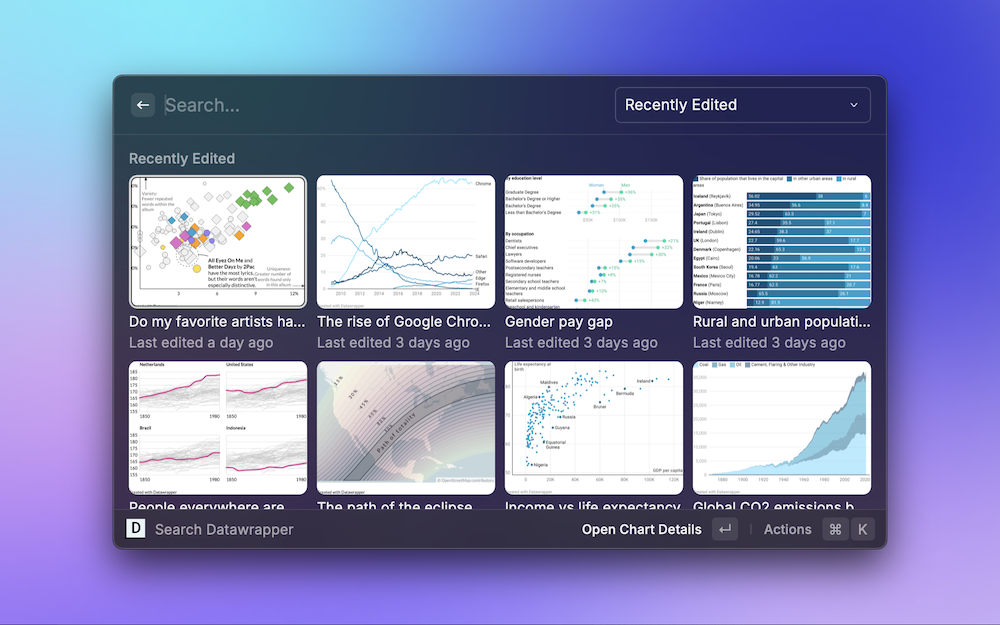 Raycast is an incredibly powerful Mac spotlight replacement. In Spring 2024, I built this extension for Raycast with their React-based API. It allows the user to view, search, open, and duplicate Datawrapper data visualizations anywhere on their Mac! I've also thrown in commands for opening the new chart workflow and viewing the tooltip "parser" functions.
 -
React -
Datawrapper
Articles Featuring My Work
Press from around the web that has featured my work.
- The Colorado Sun - Opinion: As Colorado governor, my initiative is helping redefine how states view education as federal support changes
- Inside Higher Ed - New Report Challenges Conventional Wisdom on Economic Mobility
- The Charlotte Observer - Are noncitizens in North Carolina eligible for Medicaid? Some are. Here are the rules.
- WFAE - North Carolina immigrants report language, discrimination as barriers to health care
- Delaware Online - County leaders find a COVID-19 gold mine - in sewers
- Delaware Business Times - Data Innovation Lab seeks to provide insights into COVID, beyond
- Technical.ly - Google Trends reveals how we're managing stress (Wilmington's CompassRed recently published a data roundup showing the impact of social distancing.)
Note: This website design uses the Aria template with Tailwind CSS, implemented for Astro by Kai Bi.
Return to top